I managed to secure a contract for a yoga teacher, she informed me the website must be unique and have a sense of serenity. It was necessary for me to assess what this trite statement meant.
The first actions were to create a ‘mood board’ from the pictures she possessed, then I enquired if she had a particular theme for the website. She reiterated that the website must be unique and have a sense of serenity. I began to ask her questions about her favourite colours and places of serenity. I asked if she wanted her website to have the dichotomy of a sense of ‘movement’ and ‘stillness’ as with the concept of ‘Ying and Yang’.
Considering yoga is from Asia, I wanted to incorporate the philosophy of the continent into the site. I decided on a sand beach color with a sky-blue effect. I drew this for her as a wireframe and eventually designed it in Adobe Photoshop.
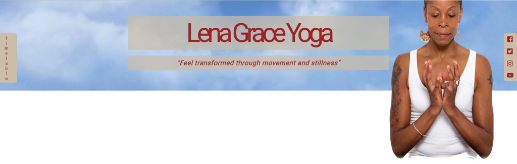
Then I decided on having a looping video of the sky behind her, as she had a marvelous picture of her in the ‘lotus position’ with her eyes closed, it would appear as if she had ‘elevated’ to the heavens. I enquired if she was familiar with Sanskrit, as it is the root of all languages and appears adjacent to Buddha. Therefore, I coded the headings for the letters to touch and nearly overlap, as this is a characteristic of the ancient language. Also, I discussed with the client the possibility of her updating the website herself, for which she would need to learn the basics of WordPress.

above: A sample of Sanskrit

above: A sample of the headings within the site and its similarity to Sanskrit
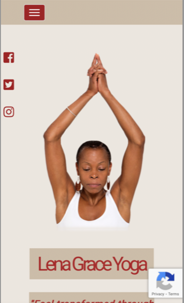
above: The banner at mobile view
The website looks very different on a mobile device, also, testimonials needed to be displayed in a subtle method, which did not distract the visitors. The timetable and social media needed to be prominent, therefore, I decided to have those sections fixed to the same position on each page.
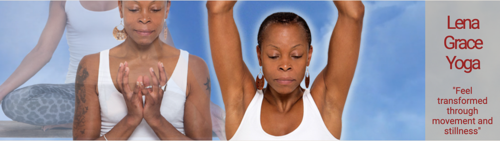
Additionally, within the static banners I showed the ‘spiritual growth’ of the Yoga teacher, as the first picture from left to right shows her as translucent, the second picture shows her transparent and the final completely opaque, with a glow around her. As the client wanted to show her journey, represented in a subtle picture ‘progression’ format.